Menu
- Home
- Projects
-
Social
- 240410_GZ Vanke
- 240322_Huawei Wangfujing Store
- 240320_Huawei Store
- 240307_Huawei Store
- 20240305_Huawei Wangfujing Store
- 20231222_NJ_Community Oasis
- 20231129_NJ_Community Oasis
- 20231121_DG Vanke
- 20230401_Community Center
- 20230329_Community Center
- 20230328_Community center
- 20230318_Fusion
- 20230314_Fusion
- 230311_Fusion
- 230222_Carolyn Speaking
- 230214_ Micr-O
- 230210_ Micr-O
- 230112
- 221224_ The Sky-Cellar
- 221222_The Sky-Cellar
- 221220_ The Sky Cellar
- 221217_ The Sky-Cellar
- 221213_ Super Tight
- 221206_Sky City
- 221104_ the model or the render
- 221202_Sky City
- 221110_service appartment
- 221108_ Showroom
- 221102_Carolyn speak
- 221026_Sky City
- 221014_Sky City
- 221012_Sky City
- 220922_Carolyn_Event
- 220901_The_Arcade_HZ
- 220827_The_Arcade_HZ
- 220825_The_Arcade_HZ
- 240822_The_Aracde_HZ
- 220823_The_Arcade
- 220630_Y-Loft City
- 220517_HZ Theatre
- 220516_Hangzhou Plan
- 220513_Heritage Curve
- 220506_Heritage Curve
- 220429_CO2
- 220428_CO2
- 220413_CO2_Beijing
- 220405_The_Valley_HZ
- 220404_The_Valley_HZ
- 220311_The_Valley_HZ
- 220310_The_Valley_HZ
- 220309_Micro_Model
- 220226_Paperless_Pavilion
- 220225_GZ_Design_Week
- 220222_Paperless_Pavilion
- 220221_GZ_Design Week
- 220215_Sky_City
- 220214_Sky_City
- 220203_H2O
- 220128_H2O
- 220122_H2O
- 220121_H2O
- 220118_GZ_Design_Week
- 220114_Sky_City
- 220112_Sky_City
- 220110_GZ Design Week_Ben
- 211124_Sky_City
- 211110_Sky_City
- 210913_Sky_Cellar
- 210909_Sky_Cellar
- 210907_Superimpose_On-Site
- 210906_Y-Loft_City
- 210823_HZ Community Center
- 210819_HZ Community Center
- 210816_HZ Community Center
- 210813_ReVeil
- 210809_ReVeil
- 210808_ReVeil
- 210805_ReVeil
- 210730_Interni Magazine_Guangzhou
- 210714_WELL
- 210706_WELL
- 210701_WELL
- 210628_WELL
- 210625_WELL
- 210624_WELL
- 210609_Superimpose Lecture
- 210531_Shadow Play
- 210528_Shadow Play
- 210527_Haiyue Site Visit
- 210516_Dutch Culture Presentation
- 210514_Micro
- 210513_DFA
- 210511_Micro
- 210510_Micro
- 210508_Micro
- 210506_Roca Presentation
- 210427_Ningbo Sails
- 210426_Ningbo Sails
- 210425_Ningbo Sails
- 210415_Ningbo Sails
- 210414_Ningbo Sails
- 210408_Micro
- 210406_Micro
- 210328_Micro
- 210327_Micro
- 210325_Y-Loft
- 210324_Y-Loft
- 210322_Y-Loft
- 210319_Y-Loft
- 210317_Y-Loft
- 210316_Y-Loft
- 210315_Y-Loft
- 210314_Y-Loft
- 210313_Y-Loft
- 210312_Y-Loft
- 200503_H20
- 200429_H20
- 200418_HZ Community Centre
- 200408_HZ Community Centre
- 200206_West Lake
- 191108_SOHO 3Q
- 191106_SOHO 3Q
- 190726_Anshun BnB Village
- 190619_Phnom Penh
- 190315_CO2
- 190308_HZ Four Season Bridge
- 190112_Superimpose_Site Vist
- 190109_HZ Sales Gallery
- 181010_CO2 Dezeen
- 180929_CO2 Pavillion
- 180928_CO2 Pavillion
- 180926_CO2 Pavillion
- 180924_CO2 Pavillion
- 180923_CO2 Pavillion
- 180914_Kindergarten
- 180913_Kindergarten
- 180912_Working Outsite
- 180905_Hexi
- 180901_BTV
- 180831_BTV
- 180828_BTV
- 180810_Pan_Photoshoot
- 180727_CZ Exhibition Centre
- 180620_WELL Detail
- 180619_WELL Detail
- 180618_WELL Detail
- 180615_Design Competition Win
- 180514_CZ Exhibition Centre
- 180428_CZ Exhibition Centre_02
- 180428_CZ Exhibition Centre_02
- 180425_CZ Exhibition Centre_01
- 180418_Y_Loft
- 180412_Budget Facade
- 180404_Micr-O Plan
- 180322_USA Project
- 180312_Sky Cellar_Beijing
- 180310_Sky Cellar_Beijing
- 180308_Sky Cellar_Beijing_01
- 180308_Sky Cellar_Beijing_03
- 180308_Sky Cellar_Beijing_02
- 180214_CZ Exhibition Centre
- 180113_Idea Farm
- 171203_Future Cities Forum
- 171029_American Architecture Prize
- 171008_Iconic Award
- Office
- Media
- Contact
- 中文
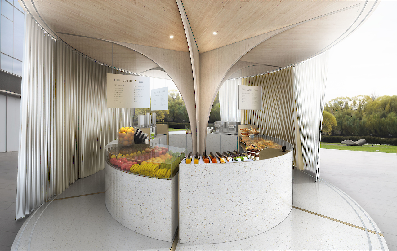
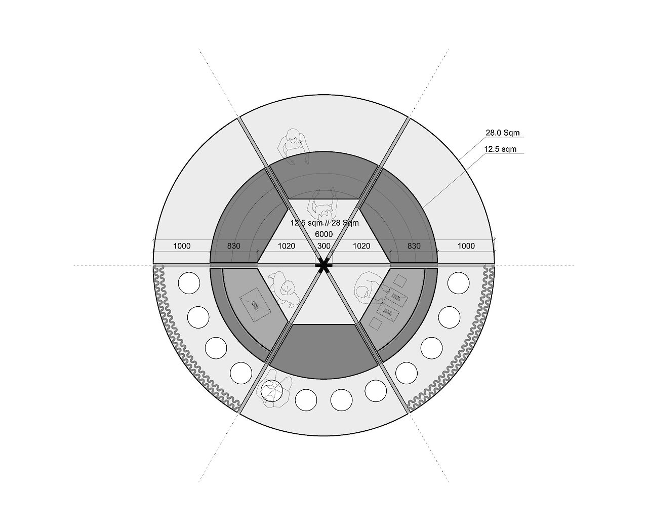
The Juiceting
Program
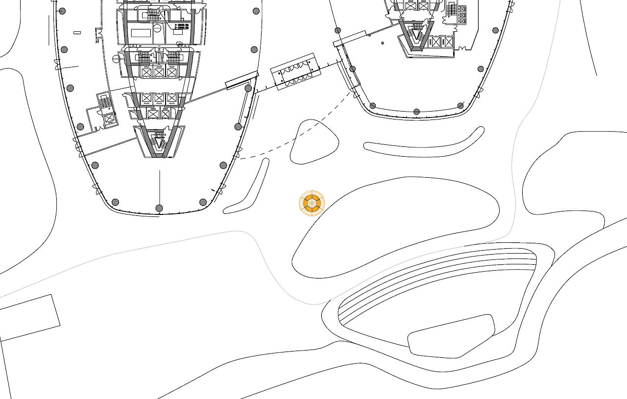
/ Juice Store & BrandingLocation
/ Beijing, ChinaSize
/ 45 sqmClient
/ Juiceting HoldingsScope
/ Architecture Design and Branding DesignStatus
/ DesignTeam
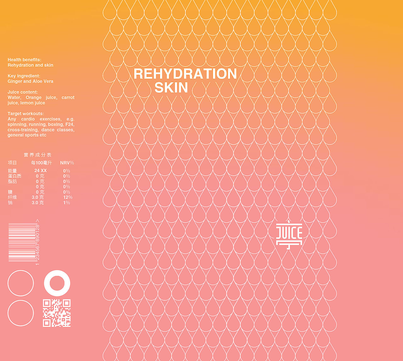
/ Carolyn Leung, Ben de Lange, Ruben Bergambagt, Yoloen Sung, Guillermo Ayala Samaniego, Inci Lize OgunJuiceting is an upcoming juice brand, which promotes wellbeing and a healthy lifestyle. As part of a new collaboration between nutritionists from the UK and an investor from Hong Kong, Superimpose has been appointed as the branding and (interior) architecture designer. The branding design includes logo design, bottle design, and house style design. The Juiceting logo combines the Chinese character ‘Ting’ (亭), a hub that gathers people, with the English word ‘Juice’.
Together ‘Juiceting’ underpins a clear customer and health oriented identity. The branding design is simple yet distinctive, and allows the product and ingredients to speak. The architecture of the physical shop projects the vision of a ‘ting’. A circular bar structure that invites customers from all sides, with products clearly displayed all around, promoting interaction with the well-trained and friendly juice makers. Prototypes for physical Juiceting shops will be built in major retail developments in China. It will be launched in China in 2019.